Saturday, August 28, 2010

The Birth of Impressionism - Part One


The Birth of Impressionism exhibit at San Francisco's de Young Museum is marvelous. It places Impressionism, and its beginnings, in its historical and art historical context. The show begins with French Academic painting, and shows successful paintings from the annual Paris Salon exhibition. The Salon was the place to exhibit work, in its day. Success there ensured a painter like William-Adolphe Bouguereau of well-heeled patrons, and a lucrative career.

The Birth of Venus, 1879, William-Adolphe Bouguereau

At the Salon, paintings were hung floor to ceiling, as this exhibit below from the Owens Salon, part of Owens Art Gallery in Canada, demonstrates. Walls were dark - often a burgundy-ish color, as the walls were at the de Young for the Birth of Impressionism exhibit.

Salon-style exhibition at Owens Art Gallery, New Brunswick, Canada

Judges at the Salon determined what work would be hung where. Celebrated paintings of the time were slickly finished, with invisible brushstrokes. Their subjects were idealized, preferably mythological. If the judges didn't like the work, it would be placed high up - where it would be hard to see. One obvious solution for artists was to work very large; many paintings for salon exhibits were painted on a grand scale for that reason. The Bougeureau painting above is nearly ten feet tall.

It's much easier to realize how different the work of the Impressionists was to the eyes of their contemporaries, when you see typical Salon paintings, with their slick finishes and idealized subjects. It's easier to recognize how difficult it was for them, and for other painters who defied the French Academy, to strike out in their own directions. Edouard Manet continued to try to gain acceptance by the Academy, and its Salon, while painting as he chose. The show included beautiful paintings of his, including The Lady with Fans and The Fifer.

The Lady with Fans, Nina de Callias, 1873, Edouard Manet


The Fifer, 1866, Edouard Manet

More subtle, but with a wonderful story behind it, was this small painting of a single spear of asparagus.

Asparagus, 1880, Eduoard Manet

Manet sold another still life painting of a bunch of asparagus to Charles Ephrussi, who loved it, and paid him more than the asking price. In answer, Manet painted this small painting, and sent it to Ephrussi, saying in a note that there was one missing from the bunch.

By, the way, although this wasn't in the exhibit, here's the original bunch of asparagus....

The Bunch of Asparagus, 1880, Edouard Manet

(To be continued...)

To learn more about French academic painting and how Impressionism differed from it, see my blog post French Academic Painting in the 19th century.

Tuesday, August 17, 2010

Thinking about Claude Monet

Impression: Sunrise Claude Monet, 1872

Have you seen the Birth of Impressionism show at San Francisco's De Young Museum yet? Are you planning to? Are you interested in joining a group to see it (we'll get a great discount rate if we get ten people together)?

If you are interested in carpooling and seeing the show (for the first time? again?) on Thursday, August 26th, email me or give me a call.

In the meantime, here are some wonderful articles online, from a special NPR series (you can listen to it, too, if you'd prefer: Monet in Normandy: The Making of Impressionism.... There's a wonderful slide show, too.


3. Monet the Gardener: Life, And Art, Grow At Giverny


Monday, August 9, 2010

Painting the costumed model – looking back

Painting study © 2010 Karen Lynn Ingalls

As I thought about this week's workshop, Painting the Costumed Model, I began pulling out studies I'd done in my Costumed Model drawing and painting group in Carmel.

Painting study © 2010 Karen Lynn Ingalls

Looking at what I'd painted from ten to thirteen years ago, I could now see so many things I wanted to work on!

Painting study © 2010 Karen Lynn Ingalls

It was fun to deduce what colors I'd used in each one. My palette was very different then – mostly experimentational – and included colors I haven't used in years (like Alizarin Crimson - can you tell?). As you can also see, I was experimenting stylistically, too.

Painting study © 2010 Karen Lynn Ingalls
Here are some of the results.

Painting study © 2010 Karen Lynn Ingalls

Some I may still do a bit more to – and I have more in process. And more waiting!

Painting study © 2010 Karen Lynn Ingalls

I like coming back to these with everything I have learned in the interim – it wasn't exactly like picking it up where I left off. I didn't have the model in front of me, too, but that enabled me to work on each study simply as a painting.

Tuesday, August 3, 2010

Soft Block Printing workshop - Photos

Jane inking the block © 2010 Karen Lynn Ingalls

The soft block printing workshop was so much fun – it's an enjoyable process! Taking two days for it allowed us to spend the second day printing, while we needed much of the first day for carving the blocks and making test prints as we developed them.

Using a key for registration © 2010 Karen Lynn Ingalls

We used various methods of printing multiple colors. These photos were all taken on the second day, so I'm sorry to say I don't have any of Connie, who was with us on Saturday.

Ready for the second color © 2010 Karen Lynn Ingalls

Here you can see Carolynne's printing in progress. This was the second color of her print. The first run was of yellow, striking against the lavender color of the paper.

Printing the block © 2010 Karen Lynn Ingalls

Carolynne was making a series of printed cards. This method works beautifully for hand-printed cards.
Carolynne's two color print! © 2010 Karen Lynn Ingalls

This printing process was a reduction cut - with further printings from the same block, which you continue to cut more of. The tricky part is that you can't go back to print more of the first run, once you've cut the block further. You have to really plan in advance.

Hand coloring the block © 2010 Karen Lynn Ingalls

Notice the two blocks? Here you see a second block, using the same design, created from the first, as well as the first block (with its reduction cut), which is being hand colored.

Carolynne's cards and prints © 2010 Karen Lynn Ingalls

Here are some of Carolynne's prints, including several on rice paper, which works beautifully for block printing. Everyone was pleased with the results they got from printing on rice paper.

Donna and her beehives © 2010 Karen Lynn Ingalls

Donna experimented with different ways of combining different blocks or parts of blocks in the same print. She asked herself, what would the hive be like both with and without a background? And what would it be like with bees?

Donna's beehives, with bees © 2010 Karen Lynn Ingalls

Voilà! Bees!

Donna's Isis prints, in copper and gold © 2010 Karen Lynn Ingalls

You can see both the cards Donna created from her Isis block and her Isis and beehive blocks.

Betsy at work, surrounded by blocks, inks, printed gift tags, and carving tools © 2010 Karen Lynn Ingalls

You can see some of the tools we used in the course of creation during the weekend, in the array Betsy is working with at her table.

Betsy with her gingko leaf prints © 2010 Karen Lynn Ingalls

Betsy used several small blocks to create sets of gift tags, using different combinations of colors and different methods of creating multiple colors. Here is one of her wonderful gingko leaves.

Betsy's handmade gift tags, printed with multiple colors on different papers
© 2010 Karen Lynn Ingalls

It's amazing to see the variety of results you can get from one simple block....

One of Betsy's handmade gingko gift tags © 2010 Karen Lynn Ingalls

The subtlety of this hand-applied second color adds a richness to the print. Red and copper make a beautiful combination.

Carolynne and Jane admire one of the prints of Max © 2010 Karen Lynn Ingalls

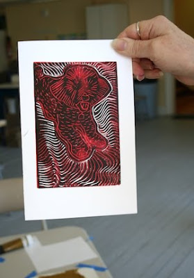
Jane created a series of prints of Max, her dog, using different combinations of red, black, blue, and gold, with white paper.
Max the Bichon, up close © 2010 Karen Lynn Ingalls

The liveliness of her carving makes for a fun print. We realized, looking at everyone's results, that sometimes when the registration of the second color is a little bit off, it creates some nice special effects with the paper. Happy accidents!

Jane's prints of Max © 2010 Karen Lynn Ingalls

Look at the variety of possibilities! Again, these were all printed from one block.

Admiring Jane's prints of Max © 2010 Karen Lynn Ingalls

This second day of printmaking was a wonderful exploration of possibilities. What a joy! That's what soft block printing is all about, for me.

I'm tentatively scheduling one more Soft Block Printing workshop for the year, in October, for those who would like to learn the process and create cards or prints for the holidays. I'll post the date and time when it is definitely scheduled.

Sunday, August 1, 2010

Elizabeth Gilbert on nurturing creativity

This talk – Elizabeth Gilbert on nurturing creativity – by writer Elizabeth Gilbert, the author of Eat, Pray, Love (yes, the same book that's been made into a movie with Julia Roberts) – is a wonderful way to nurture your own creativity or give yourself an inspirational jumpstart.

The website description of this twenty-minute talk (well worth the time) is "Elizabeth Gilbert muses on the impossible things we expect from artists and geniuses – and shares the radical idea that, instead of the rare person 'being' a genius, all of us 'have' a genius. It's a funny, moving and surprisingly personal talk."

Here's to divine inspiration and creativity - Olè! (You'll understand when you watch the video.)

Monday, July 19, 2010

Soft Block Printmaking Workshop


I'm looking forward to next week's Soft Block Printmaking workshop (either a one-day workshop on Saturday for those who want to try this out for the first time, or a full weekend workshop for those who want to really plunge into all the things you can do with this medium).

If you have done linoleum or wood block printing before, this is a little different. Soft blocks are made of new materials created in recent years. They cut like butter, and their ease of cutting makes it a much more enjoyable process (for me, anyway). The ones I recommend are Speedball's Speedy Carve blocks – the pink ones in the stack below.
Speedball's Speedy Carve stamps are the pink ones

In addition, Speedball, a printing supplies company, invented safety cutters – called LinoZips – that are easier to hold and to manipulate, and that create beautiful curving lines with much more ease. Besides that, we're using water-soluble inks – so there's no solvent smell. Ain't technology wonderful? Each of these things has made the block printing process simpler and, for me, a lot more fun.
One of my Christmas cards – Angel of Peace © 2004 Karen Lynn Ingalls

The first day will be about getting your design on the block, and carving the block and printing it. For those who are interested in printing more than one color, we'll get started on different methods of doing that, too.

The second day, we'll continue with different methods of printing multiple colors, including hand coloring, reductive printing, and using a key block. We'll also do a little block printing on fabric, so be sure to bring things you'd like to print on (cotton shirts from consignment or thrift shops, pieces of old sheets (for experimentation and something special!), white dish towels, canvas tote bags, T-shirts, or...?

You can register online at the Calistoga Art Center's workshop page. If you'd like me to supply your materials, please give me a call to let me know in advance at (707) 942-0197.

One additional workshop is coming up this summer – Painting the Costumed Model! Stay tuned....

Abstract Landscape Painting Workshop Photos

Here, I'm demonstrating layering (using a plastic fork) © 2010 Erik Bolijn

Wonder what you missed in the Abstract Landscape Painting workshop? Here are some photos, taken by Erik Bolijn and myself.

Erik working on his first painting of the day © 2010 Karen Lynn Ingalls

We took three different approaches to painting the landscape in an abstract manner. Here, everyone is working on the first one.

Jaime, Pat, and Lois work on their first paintings of the day © 2010 Erik Bolijn


Lois's Horizon painting © 2010 Karen Lynn Ingalls

Painting abstract landscapes is a wonderfully freeing thing. We began with ideas or memories of images, or the images of the landscape themselves, but in abstracting it we're free to take the painting in directions we (and it) want to go. We're not tied down, and we don't have to get wrapped up in detail.
Demonstration, the second painting of the day, in its first stage © 2010 Karen Lynn Ingalls

Here is the beginning stage of my second demonstration painting.

Erik working on his second painting of the day © 2010 Karen Lynn Ingalls


Pat, Jaime, and Lois work on their second paintings © 2010 Karen Lynn Ingalls


And here are some of the results. Pat had to leave us early, and hers unfortunately aren't included. Some of these may be completed – and some may still be in process. Creativity is a wonderful thing – we had a great day of it!

Lois with her second painting © 2010 Karen Lynn Ingalls


Erik and his paintings © 2010 Karen Lynn Ingalls


Two of Jaime's paintings © 2010 Karen Lynn Ingalls


Jaime with her ecstatic sunset painting © 2010 Karen Lynn Ingalls

Here's to creativity and taking images, ideas, feelings, and sensations to new places!

Monday, July 5, 2010

Abstract Landscape Painting Workshop

I'm settling down after the weekend's excitement, what with the county fair and Calistoga's Fourth of July parade (the Silverado parade - it was great!), and looking forward to this coming Saturday's painting workshop.

I've got a lot to pack in to the time, so it will be a full and fun day. We're going to look at several different artists for inspiration – artists who begin with the landscape as their inspiration, but who take it in very different, and abstracted, directions. Then we'll take three different approaches to abstraction, trying them out for size. It's a good way to experiment and find out not only what interests you the most, but find out what approach feels best to you.

Are you wondering which artists we'll be looking at for inspiration? If you're familiar with my classes, you may recognize some of them. But you may not have seen the work of Tina Mammoser, an American artist living and working in England. Her work is inspired by the sea and the English coastline. Notice the layering, the sense of depth and space she creates, all within simplified, abstract compositions of absolute integrity. My favorites among her current pieces are her Black, Coast, and Lake Michigan series, but the smaller works are also lovely. I hope you'll take a look at her work – and take inspiration in what you see.