Monday, December 14, 2009

More painting with gesture, energy, and music...


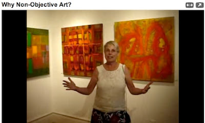
Abstract painter Lynne Taetsch describes a process similar in many ways to that of Jonas Gerard. That is, she turns music up loud and just paints, using big gestures and moving to the music. It's an energetic process that is evident in the feeling of energy in the paintings themselves.

In the YouTube video "Why Non-Objective Art?", taped at a gallery talk at The Edward Hopper House Art Center in Nyack, New York, Taetsch describes how she works in layers, using methods that will be familiar to you from class. After going through the big gestural phase of the painting, she steps back to see what the painting needs. She turns it around in all four directions, not only upside down.

She talks also about how everything she sees influences her work – not only art she looks at. Colors and symbols are important to her. But what is most important to her is the experience of painting, the process itself – she has no idea, when she's beginning, of where the painting will lead her.

She also talks about how she doesn't think in words when she's painting – she thinks visually. It's the difference between getting out of our linear, logical, right-brained mode of thinking and shifting into visual, holistic, left-brained processing. Different painters have different ways of making that shift – painting to music is a good method.

It's a wonderful, thoughtful conversation about how painters paint and what goes into the process of creating art. You can also see Lynne Taetsch talk about her painting process, especially about working in left-brain mode, and abstract art in the video "Painting Abstract Art." You can find her work online both in the video "Modern Art: Paintings by Lynne Taetsch," and at her website ArtByLT.com.


Monday, December 7, 2009

Dancing with the brush

Still photo from Jonas Gerard – Asheville Painter, by BlindLyleFilms

Ever feel like you need to loosen up in your painting? Wish you could get out of your mind and just paint? Just dance with the brush?

Watch painter Jonas Gerard on YouTube. Seeing his painting process is inspirational – and it makes you want to get up, grab a brush, turn on your favorite music, and paint away.

"You learn to trust – and that everything happens for a reason," he says, in the video Jonas Gerard – Asheville Painter. "Give up results – give up planning — give up worry – and, a big one — a big, big one — give up fear."

He demonstrates on large canvases, dancing to the music, dashing with lines, slapping on paint, carving rhythmic shapes out of the paint, brushing in large areas, all quickly, all spontaneously, all with large house painting brushes, trowels, rags, whatever he has to hand....

"Painting fast gives you – gives the opportunity for the mind to be quiet. ... It shuts off... it goes on, 'All right – let him do his thing.'"

Jonas Gerard Live Painting shows, in time lapse, the creation of two very large paintings, one a museum-sized triptych, followed by a series of still photographs of some of his large paintings. There are also more videos of Gerard painting and being interviewed, which can be found by searching for "Jonas Gerard" at www.YouTube.com.

Friday, November 20, 2009

Photographing scenes for painting

Fall is just about over – and we've been lucky to have some spectacular colors this year. The photograph above was taken on Palisades Road, just northeast of Calistoga, off the Silverado Trail – a great place to explore with a camera if you haven't yet.

As winter moves in, and the grape leaves brown and fall, you can still get some beautiful shots with stormy, cloudy skies – interesting, moody photographs that could be good inspiration for your work. And before long, mustard will be blooming between the winter vines.

I always take a stepladder with me when photographing – a small, two step, metal one with a handle on top that makes me feel slightly safer when standing on the top step. It's small enough to carry in the car, and tall enough to give me a little height when taking photographs. That extra height is especially helpful when I want to get above the vines just enough to show something of the sea of color that they can be....


Wednesday, October 28, 2009

Georgia O'Keeffe's Pears


Here is a simple painting of two pears by American painter Georgia O'Keeffe (1887 - 1986). Although it's not the kind of image we usually associate with her – the close-up paintings of flowers, or images of cow skulls or Southwestern landscapes – it has the same kind of simplicity and monumental feeling as her more familiar work.

Notice how she uses multiple shadows as compositional elements? They ground the pears in the white space, and they help relate the pears to the edges of the white cloth (I assume it's a cloth resting on a table). Without them, those wonderfully solid, modeled pears would float in the white space.

Notice how the cloth's edges are tilted, giving the painting a dynamic feeling? O'Keeffe uses this to create strong and interesting negative spaces. There is still no doubt that those lovely pears are the focal point of the painting. Why? It's partly because the shadows lessen the contrast between the edge of the cloth and the dark table beneath it; partly because she has lightened the shadow around the pear stems, creating greater contrast between them and the white of the cloth; and partly because the shapes of the pear tops and stems are so interesting.

You can see more of Georgia O'Keeffe's work, and read about her life and her homes at www.okeeffemuseum.org.

Tuesday, October 20, 2009

Leading the eye to a painting's focal point


Once you've determined where you want your painting's focal point to be, there are a number of ways that you can lead the eye there.

Leonardo da Vinci's masterpiece, the Last Supper, painted from 1495 to 1498, illustrates several methods beautifully; we'll look at two. They are: the uses of converging lines and contrast in value (light and dark).

1. Converging lines - Notice how the lines of the room all converge, in perspective. They lead the eye in to the center, pointing to the face of Jesus - who is both the center of interest and the focal point of the painting.

2. Contrast in value (light and dark) - The eye is typically drawn to the area of greatest contrast between light and dark. In The Last Supper, the greatest contrast is between the dark of Jesus's hair, framed by and contrasted against the white of the window behind him. This further emphasizes Jesus as the focal point. Although your eyes may scan the other figures, or other parts of the painting, your eyes will always return back to his face.

How can you use this in your own painting?

Ask yourself, does the painting have converging lines? If it does, do those lines take your eye where you want it to go?

Then look to see where you have the greatest contrast between light and dark, side by side. Is that at your focal point?

If your answers are no, they will give you clues about what to do next, in order to make it work.

Finding your focal point


The focal point should be the center of interest of your painting. Consider your subject; what do you find the most interesting? Where do you want to lead your viewer's eyes? Where do you want their eyes to rest?

The focal point of a painting is the place where the viewer's eye wants to go. The question is, is that where you want the viewer's eye to go? Is it the same place that you thought was the center of interest?

You can test this easily by turning the painting upside down (sideways works, too, as does looking at the painting in a mirror). Looking at a painting upside down takes everything out of context. Instead of seeing objects - a tree, a river, a couch, an apple, a person - you see things in terms of shape, value (light and dark), and color.

A big part of making a painting work is finding a way to lead the viewer into the painting, and to the focal point - making it the painting's center of interest. Finding your focal point is the first step.

Wednesday, October 14, 2009

Artrails this weekend!

The second and last weekend of Artrails, Sonoma County's open studios program, is this weekend! You can visit artists in their studios from 10:00 to 5:00 on both Saturday and Sunday. Who to visit, with 141 artists to choose from? You can look at the Artrails directory online to see whose work interests you.

We also looked last week at the work of Andy Williams, in Salinas. You can find his blog at Andy Williams Studio (if you like his work, you might want to bookmark his blog - it can be hard to find because of so many references on search engines to the singer).

Tuesday, September 29, 2009

Drawing ellipses - a couple of online tutorials

We'll be drawing ellipses in class this week. They come up so often in still life painting - the tops of pitchers, jars, bowls, plates, cups, vases, flower pots - not to mention when your painting includes bikes or cars or anything with wheels. (There is even a landscape painting method that uses ellipses - remind me, and I'll post information about it later, when we're talking about landscape painting.) It's a good thing to practice.

As usual, the internet is a wonderful resource for learning more. Here are a couple of helpful online tutorials on drawing ellipses:

Here's a great tutorial on drawing ellipses, on the internet, explained by artist Mike Sibley, at http://www.sibleyfineart.com/tutorial--draw-ellipses.htm

And here is another tutorial on drawing ellipses by animation teacher GlennVilppu, from Animation World Magazine: http://www.awn.com/mag/issue3.11/3.11pages/3.11vilppu.php3

You'll be surprised how spending a little time practicing now, even sketching small ellipses on scratch paper, will serve you well later in your painting.

Monday, September 28, 2009

Thumbnail sketches continued...

Thumbnail sketches of apple ©2009 Karen Lynn Ingalls

Here is another set of thumbnail sketches from a demonstration in class. Notice how they are simple and loose? Because of the small size, it is easy to play with different compositions. You can try both vertical and horizontal formats, and play with different perspectives and placements. Each one only takes a couple of minutes.


First stages of blocking in the composition, demonstration painting, ©2009 Karen Lynn Ingalls

This time I chose the first sketch, on the top left. I made a few changes in my composition (you may see the original lines of the table below the current ones). When I turned my composition upside down and stepped back, I realized it needed changes that I hadn't spotted when it was right-side up. I didn't want the edge of the table to touch the bottom of the painting. Notice how the negative spaces are more interesting in the painting than in the original sketch?

When you're working with your original composition, see where the light and shadow are falling. Light and dark can become interesting elements in your composition.

Do not worry about details at this point! You are blocking in the big shapes of your composition; this stage of the painting is all about establishing your composition.

Saturday, September 12, 2009

Beginning a painting


Thumbnail sketches give you a great way to work out different compositional ideas, quickly and in miniature. They allow you to spot compositional weaknesses, and work out patterns of light and dark, all before you ever begin the painting in earnest.

Here are three thumbnail sketches of a pear I drew as part of a class demonstration in the last couple of weeks. (Please pardon the images showing through from the handout on the reverse.... See? You don't even have to use nice paper for these. They're quick and easy.) Looking at the three, I decided I preferred the composition on the top right. I worked out the lights and darks. Then I was ready to turn to my painting.

When you begin your painting, remember that you can't get to the end when you're only just beginning. Often students are tempted to focus on some lovely detail in some small part of the painting - like the lighting and surface details on that juicy pear - instead of working all over the whole surface. It's going to look sketchy at first - that's okay! That is actually a very good thing!


The important thing is to get your composition worked out and make sure you like it. Turn it upside down. Is it balanced? Are the negative spaces interesting?

Then, after you've made any changes to the initial composition, block in big shapes of color. Don't leave white spaces! (I know this is hard for watercolorists.) If you leave a space white, that white will assume more and more importance as the painting progresses - and you will become more and more nervous about what to do there. Be kind to yourself - you can avoid a whole lot of stress by just putting color there. Don't worry. You'll change it later anyhow. Trust me.

Calistoga Art Center's new space


Classes have moved to the Calistoga Art Center's new space, in the historic Masonic Building on Lincoln Avenue (Calistoga's only building with three stories and an elevator). It's a lovely, light-filled space on the second floor. We may now have enough elbow room for everyone - and enough room for easels, too!

Tuesday, September 8, 2009

Blocking in the composition of a painting

Every painting begins by blocking in the composition. There may be as many variations of how to do this as there are painters, but we still share the basics.

In class, we talked about drawing in the lines of the composition, either with paint, or water-soluble fabric pencils or fabric markers (whose lines will dissolve when we come along with water and acrylic paint). Then you begin blocking in the big shapes of your painting. It's all very rough at this stage - you don't want to even think about the details yet.

Painter Jerry Fresia, originally from San Francisco but now living in Lake Como, Italy, has posted a great example of how to block in a painting in "A Painting Class on Lake Como, Italy." While he is painting in oils rather than acrylics, and begins drawing his composition with charcoal initially (vine charcoal is often used by oil painters for this), his process is basically the same one I demonstrate in class.

Notice how he also chooses to scumble in his colors initially (not as necessary for acrylic painters as oil painters) and how he works from darks to lights. He breaks down his painting process into different stages of development that are helpful to see. And while you're watching, enjoy the views of Lake Como and the beautiful castle he lives in!

Thumbnail Sketches

In class, I've been talking about and demonstrating the usefulness of thumbnail sketches. They allow you to quickly work out different compositions before diving in to your painting. Often the first, most obvious ideas may not be the most interesting compositions - and drawing a series of thumbnail sketches allows you to make that discovery before you even begin your painting.

YouTube is a great resource for learning about art - you can watch demonstrations of paintings in progress and instructional videos created by artists for other artists. Here are a couple of videos where you can watch thumbnail sketches being created:

"Thumbnail Sketches," a video posted by AnnelieArt, is a 48-second example of playing around with lines and moving different compositional elements, just to see what you come up with.

"How to make a thumbnail sketch for an oil painting" is a minute-and-a-half long demo from Expertvillage of creating a values sketch (values refers to light and dark).

Both are quick, good reminders of the possibilities thumbnail sketches allow us to see.

Resources for Artists and Art Lovers

Twice a week, British Columbia painter Robert Genn sends me a thoughtful, thought-provoking letter. I'm not the only one who gets to read these gems. I've probably been subscribing since 2000 or 2001; since that time, his list of subscribers has grown by hundreds of thousands. He writes about what's on his mind, artistically speaking; shares his experiences painting all around the world; talks about the creative process; and responds to the questions of correspondents. I always learn something new.

You can read about the newsletter and subscribe at www.painterskeys.com. If you'd like to read a sample of previous letters, posted with the responses of his subscribers, you can pick from a selection of current ones at http://clicks.robertgenn.com/.

If you'd like to see his work - primarily, but not exclusively, landscapes - you can find it at www.robertgenn.com.

Sunday, August 30, 2009

Good old memories at the NVOS Opening...

At the Napa Valley Open Studios opening last night, at Mumm Napa's Fine Art Gallery, I discovered that my painting was hung next to that of Earl Thollander (http://www.nvopenstudios.com/artists/68/). His painting, Winter Grapevine, is a wonderful example of his work.

For any who might not know, Earl Thollander was a master of drawing and watercolor. He compiled his drawings and sketches of rural California into wonderful (and very popular) books, long in print, beginning with Back Roads of California, and then Barns of California. His work influenced me and many others, and he was much beloved by those who knew him. Unfortunately, he died in 2001. His family is opening his studio to the public this year - my only regret is that I won't be able to go then. But Open Studios artist and master of pen and ink Nick Cann (www.nickcann.com), Peg Cann, and I will visit after Open Studios is over - something I am very much looking forward to.

I never met Earl Thollander, but I first heard about him from my grandmother. His parents and my grandparents were friends - all Swedes from Cloverdale. After my grandparents moved to Santa Rosa, when Earl would drive his parents down to Santa Rosa, he would bring them over to visit. I always heard about these visits; this was how my grandmother introduced me to his artwork. She and my grandfather gave me an autographed copy of Bug Haiku, which he illustrated. His wonderful, free, expressive use of line enchanted and influenced me. I have always had the utmost respect for his work, and was sorry I never met him.

So to see my painting hanging by his at the opening on Friday touched me more than I can say. I could feel my grandparents looking down at me and smiling....

Thursday, August 27, 2009

Open Studios Reception Friday at Mumm's

This year's opening reception for Napa Valley Open Studios will be held Friday, August 28th, from 6:30 to 8:30 p.m. at Mumm Napa Fine Art Gallery. Tickets are $15, which go to support the good works of Arts Council Napa Valley. Mumm's is at 8445 Silverado Trail, Rutherford, California.

I saw the work artists were dropping off yesterday for the show - it will be a good show! We are lucky to have James Orlando curating it again this year. I have heard that honorary co-chairs Eleanor Coppola and Kathryn Hall have been working hard to make this year even better for everyone.

You can view the website at www.nvopenstudios.com. The Arts Council's website is at www.artscouncilnapavalley.org (and there's that photo of me, too!).

Friday, August 21, 2009

Countdown to Napa Valley Open Studios!

Napa Valley Open Studios is just around the corner, and Open Studios artists like me are busy preparing for it. The catalogs just came out (they are gorgeous). You can also see who the participating artists are, and where to find them, at www.nvopenstudios.com.

alt="[Banner] Arts Council Napa Valley Open Studios" >

(That's me on the left, and Nancy Shapiro to my right.)

Monday, August 17, 2009

Napa Valley Art Festival

If you love plein air painting (landscape painting done on location), check out the website for this year's Napa Valley Art Festival at www.napavalleyartfestival.com.

Although this year's festival has ended, the website features links to all the artists who participated. You can follow them to see the work of Calistoga artist Paul Youngman (www.paulyoungman.com); Camille Przewodek (www.przewodek.com), from Petaluma; Jeanette LeGrue (www.legrue.com), who lives in Tomales and shows at Lee Youngman Galleries (www.leeyoungmangalleries.com); and Timothy Horn (www.horndesign.com) from Fairfax, among a large roster of wonderful artists.

While you're there, please don't miss the website of Beverly Wilson (www.beverlywilson.com), a California colorist (and perhaps the only one on the list who is not a plein air painter) whose work continually takes my breath away. Beverly, who lives near Napa, is preparing for Napa Valley Open Studios (http://www.nvopenstudios.com) during the last two weekends of September. It's a wonderful time to visit her and see her paintings and studio in person.

Wednesday, August 12, 2009

Umm, now where are those classes?

The Calistoga Art Center is moving! To my students, who will be receiving flyers any day now with the new location and directions - hang on to those directions. They will come in handy later.

The very latest word is that remodeling will keep us in the old location a little longer - in the white building on Lincoln Avenue (formerly shared with the Visitors' Center), next to the railroad cars, and across the street from CalMart and Dr. Wilkinson's.

New classes begin next week

Good news! Napa Valley College is continuing to offer its free community education classes, which include the adult art classes at the Calistoga Art Center. And they begin next week!

I will be teaching two sections of Acrylic Painting Workshop - one on Wednesday afternoons (starting August 19th, 2009th) from 1:00 to 4:00, and one on Fridays (starting August 21st) from 1:00 to 4:00.

The college catalog mistakenly listed the Friday course as a Mixed Media Painting class (which it was during the summer). Ooops! I will be glad to work with anyone who wants to take the class as a Mixed Media class, though.

I hope that if you know anyone who is interested in the classes, you will pass this information along to them....

Sunday, August 2, 2009

Impressionist Paintings Coming to San Francisco!

San Francisco will be one of the beneficiaries of an upcoming renovation of Paris's Musee d'Orsay. The museum, which holds perhaps the world's most extensive collection of Impressionist and Post-Impressionist Painters (correct me if I'm wrong!), is sending over 200 paintings from their collection on tour during the renovation - in two separate shows, both of which will come to San Francisco's M.H. de Young Memorial Museum.

"Birth of Impressionism: Masterpieces From the Musee d'Orsay" opens next spring, on May 22, 2010, and runs through September 6, 2010.

"Van Gogh, Gauguin, Cezanne and Beyond: Post-Impressionist Masterpieces From the Musee d'Orsay" opens soon after, on September 25, 2010, and runs through January 18, 2011.

Yes, Vincent Van Gogh's Starry Night, pictured above, will be part of the exhibition.

To read the San Francisco Chronicle article about it online, go to:
http://www.sfgate.com/cgi-bin/article.cgi?f=/c/a/2009/07/31/DD281916T8.DTL

To find out more about the Musee d'Orsay, its collections, and more (to get a little preview of some of what we'll be seeing next year), go to:
http://www.musee-orsay.fr/en/collections/overview.html

This is truly a show to plan ahead for - I know I will!

Monday, June 8, 2009

Mixed Media Painting at the Calistoga Art Center

There is room for a few more people in the Mixed Media Painting Workshop class I am teaching at the Calistoga Art Center, through Napa Valley College's Community Education program. We'll be exploring the techniques of photo transfer, collage, soft block printing, relief printing, and acrylic painting, and combine them in mixed media art pieces. We may also explore the use of metal leaf, stenciling, and an encaustic-like process, depending on student interest and time.

The class is designed for students at all levels who want to discover, experiment with, and combine new methods and materials. It will be held for six more Fridays in June and July, and is offered free to students through Napa Valley College. You can find more information at www.calistogaartcenter.org, or by calling them at (707) 942-2ART.

Yesterday's Plein Air Paint Out at Graeser Winery

Yesterday, six painters from Calistoga, Yountville, and Hidden Valley gathered for the first plein air paint-out at Graeser Winery, just west of Calistoga. There are so many views to choose from there.... I'll post photos later.

I will be giving private art workshops there soon. More details to follow....

Wednesday, May 20, 2009

More on the French Impressionists

Thanks to Em Klement for recommending the BBC miniseries "The Impressionists." You can probably find it at your local library - but here's a preview on YouTube:

http://www.youtube.com/watch?v=pG7sNukvWG4&feature=channel

They've faithfully represented a time in Western art that ushered in more changes than the artists would ever have expected, seen through the eyes of Claude Monet ("only an eye - but what an eye," as Paul Cezanne said of him).

Calistoga Art Center Students Spring Art Show

The Calistoga Art Center will hold its spring student art show and potluck on Thursday, May 21st, from 5:30 to 7:30, for current and prospective students. It's a great opportunity to see what many of the students are doing in the Acrylic and Plein Air Painting, Drawing, and Ceramic classes offered through Napa Valley College's Community Education program. You can also talk to the teachers (like me - I teach Acrylic Painting) and find out if they and their teaching would be a good fit for you.

You can also find out about new classes offered for summer, including Papermaking classes taught by Sequoia Buck and my new Mixed Media Acrylic Painting class.

The student art show will also be open for viewing during the First Thursday Artwalk on Thursday, June 4th, from 5:00 to 7:00 p.m.

Sunday, May 10, 2009

French Academic Painting in the 19th century


Comerre, The Annunciation to the Shepherds,
Winner of the Prix de Rome, 1875

Because the work of the French Impressionists is so familiar to us today, it is hard to imagine their artwork being considered shocking or revolutionary without looking at the kind of painting most of their contemporaries were familiar with. 

Now we are used to the landscapes painted en plein aire by Claude Monet. But to the painters of the French Academy, landscape painting was less well regarded, by far, than paintings depicting classical history or mythology or Biblical subjects. The paintings themselves had smooth surfaces, painted with layers of thin paints and glazes, to minimize the brushwork. Figures in the paintings were idealized, and were often meant to be allegorical.


William-Adolphe Bouguereau, The First Kiss

If you compare Comerre's painting above, the 1875 winner of the prestigious Prix de Rome, and the painting by Bouguereau, with Monet's 1873 painting Impression:Sunrise, it is a little easier to see why the newer style shocked people. Its loose, sketchy brushwork was completely foreign to eyes used to the academic style.


Claude Monet, Impression: Sunrise, 1873

A critic, in his disparaging review, referred to all of the paintings in the exhibit as "Impressionist," derived from the title of this painting. While he intended the name as an insult, it seems a compliment today....

Blogging about art and art teaching

This blog has two purposes: to present resources, information, and images for my students about things we talk about in art classes, and to talk about art and art instruction where I live, in and around Calistoga, California, at the northern end of the Napa Valley. 

I paint, and I teach painting, through Napa Valley College's Community Education program, at the Calistoga Art Center; and privately, both in individual lessons and to groups in workshops. I have a new session of NVC classes coming up at the beginning of June, both Acrylic Painting and Mixed Media Painting with Acrylics. I'll post more about both soon, but you can also find more information about classes offered at http://www.calistogaartcenter.com.